
Window treatments are one of the most impactful design decisions you can make in any room. They frame the view, control the light, and set the tone for the entire space. Fabric blinds in particular offer a level of versatility that hard materials like wood or aluminum simply cannot match, because the variety of colors, patterns, textures, and opacities available is virtually endless. The challenge for most homeowners is not finding a fabric blind they like on its own, but figuring out how to select one that works beautifully within the room they already have.
This guide walks through the key principles of coordinating fabric blinds with your existing decor, covering everything from reading your color palette to understanding how texture and pattern interact with furniture and wall finishes. Whether your home leans traditional, modern, or somewhere in between, these strategies will help you make a confident and cohesive choice.
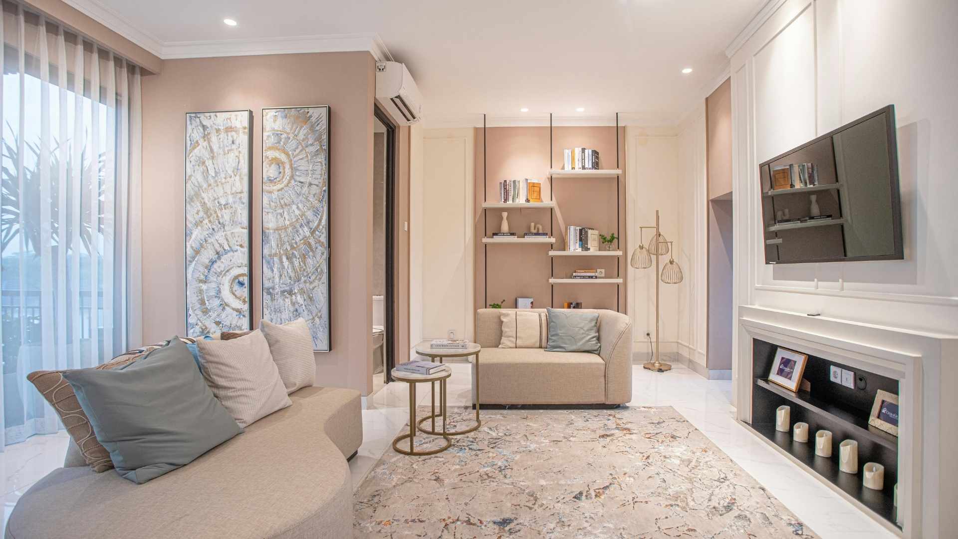
Start With What You Already Have
Before browsing any fabric samples or swatches, take a clear-eyed inventory of the room you are working with. Look at the dominant colors in your walls, flooring, upholstery, and any large furniture pieces. These are your fixed elements, the things that are staying in place, and your fabric blinds need to work in conversation with all of them. Trying to choose a blind in isolation, without considering the full picture, is one of the most common mistakes homeowners make.
Identify your room’s primary color, which is usually the wall color or the dominant shade in your largest piece of furniture, and your secondary color, which shows up in accent pillows, rugs, or artwork. A fabric blind that incorporates either of these tones will feel intentional rather than accidental. Getting this foundation right before any purchasing decisions are made is what separates a cohesive room from one that feels thrown together.
It also helps to take photographs of the room from multiple angles and bring them along when you are shopping for fabric blinds. What looks cohesive in person can be harder to visualize in a showroom, and having a reference point makes it much easier to hold a swatch up and assess whether it actually belongs in the space. Lighting in a store is almost always different from lighting in your home, so a photo under your actual light conditions is an invaluable tool.
Understanding Color Relationships in Window Treatments
Color is the most immediate visual connection between a fabric blind and the rest of a room, and understanding a few basic principles of color theory goes a long way. Analogous colors, those that sit next to each other on the color wheel, create a harmonious and restful feel. Complementary colors, those on opposite sides of the wheel, create contrast and visual energy. Neither approach is wrong, but they produce very different results, and the right choice depends on the mood you want the room to convey.
For rooms that already have a lot going on visually, a neutral fabric blind in white, linen, warm gray, or soft taupe is almost always the safest and most elegant solution. Neutral fabric blinds do not compete with patterned rugs, colorful artwork, or busy upholstery. They provide a clean backdrop that lets everything else breathe. In a visually complex space, the window treatment often performs best as a grounding element rather than another layer of visual interest.
In rooms with a more minimal or monochromatic palette, fabric blinds are an opportunity to introduce warmth, depth, or a subtle accent. A warm cream or soft sage blind in a mostly white room adds texture without disrupting the calm. A muted dusty blue in a neutral gray living room brings a quiet pop of color that feels considered rather than loud. The key in both cases is staying within the tonal range of the room rather than introducing a color that feels imported from a different space entirely.
Texture Matters as Much as Color
One of the qualities that makes fabric blinds so appealing is the range of textures they bring to a room. A woven grass or linen weave adds organic warmth and works beautifully in spaces with natural wood tones, rattan furniture, or earthy color palettes. A smooth, tightly woven fabric reads more formal and tailored, which suits traditional or transitional rooms with clean lines and structured upholstery.
Texture also affects how a room feels acoustically and thermally. Heavier woven fabrics absorb more sound than lighter sheers and also provide better insulation, which is a practical consideration for Michigan homeowners dealing with cold winters. Layering textures thoughtfully adds depth and dimension to a space that a flat, uniform surface cannot provide. A slightly rough linen blind next to a smooth leather sofa, for example, creates a contrast that reads as intentional and sophisticated.
Think also about the relationship between your blind fabric and your flooring. Hardwood floors with visible grain look great paired with textured natural weaves. Smooth tile or polished concrete floors can handle either texture or smoothness in a blind because the floor itself is not competing for visual attention. Carpeted rooms often benefit from a cleaner, smoother blind fabric to balance the softness already underfoot.
Working With Pattern: When to Go Bold and When to Hold Back
Patterned fabric blinds can be a striking design choice, but they require more care than solid or subtly textured options. The general rule in interior design is that you can mix patterns successfully as long as they vary in scale. A large-scale botanical print on a Roman shade can coexist with a smaller geometric pattern on a throw pillow because the two patterns are not competing at the same visual size. Problems arise when similarly scaled patterns are placed next to each other and create visual noise.
If your room already features patterned upholstery, a patterned area rug, or busy wallpaper, a solid or tone-on-tone fabric blind is almost always the better choice. Letting the existing patterns remain the focal point and using the blind as a grounding element rather than another competing layer will almost always produce a more polished result. Conversely, if your room is predominantly solid and neutral, a patterned blind becomes an opportunity to introduce personality and movement without overcrowding the space.
Stripes deserve a special mention because they are technically a pattern, but one that behaves more neutrally than florals or geometrics. Vertical stripes in a fabric blind draw the eye upward and make ceilings feel taller, which can be a useful trick in rooms with lower ceilings. Horizontal stripes are less common in window treatments but can work well in casual, coastal, or cottage-style interiors where a relaxed, layered look is the goal.
Matching Fabric Blinds to Different Room Styles
Different interior design styles call for different fabric blind approaches, and understanding those conventions makes the selection process considerably easier. In a farmhouse or rustic interior, woven natural fabrics in warm neutrals like oatmeal, sand, or warm white feel right at home. They echo the organic materials typically found in these spaces and reinforce the relaxed, lived-in character that defines the style.
Modern and contemporary rooms tend to favor clean-lined Roman shades or roller-style fabric blinds in solid colors with minimal texture. The simplicity of the treatment supports the uncluttered aesthetic that modern design prioritizes. Cooler neutrals like warm grays, soft whites, and muted charcoals are common choices that align with the restrained color palettes typical of contemporary interiors.
Traditional rooms have the most flexibility when it comes to fabric blinds because the style itself accommodates pattern, layering, and decorative detail readily. Rich fabrics like damask, velvet, or jacquard weave fit comfortably into formal traditional spaces. Layering a fabric blind under a set of pinch pleat drapes is a classic treatment for traditional dining rooms and living rooms that adds both depth and functionality.
Transitional rooms, which blend elements of both traditional and contemporary design, are actually the easiest to shop for because they accept a wider range of fabric blind styles. A linen Roman shade in a warm neutral works equally well alongside both a modern sectional sofa and a more traditional dining table. When in doubt about which direction your room leans, transitional fabric choices are a reliable middle ground.
Light Control and Its Design Implications
The opacity of a fabric blind affects both its practical performance and its visual weight in a room. Light-filtering fabrics allow a soft, diffused glow to pass through when the blind is lowered, which creates a warm and inviting atmosphere. Blackout or room-darkening fabrics block light entirely, which reads as heavier and more substantial on the window. The right choice depends on both the function of the room and the feeling you want it to have at different times of day.
Bedrooms typically benefit from a room-darkening or blackout fabric, particularly in Michigan, where summer mornings bring early sunlight. Living rooms and dining rooms usually work better with light-filtering options that maintain a connection to the outdoors while softening the intensity of direct sun. According to The Spruce’s guide on choosing window treatments, the opacity of your fabric should always be considered alongside the room’s natural light levels and how the space is used throughout the day.
Sheer fabric blinds occupy a category of their own and deserve consideration for rooms where you want privacy without sacrificing natural light. A sheer Roman shade in a kitchen or home office maintains brightness and an open feel while still providing a visual layer at the window. Sheers also soften the visual transition between an interior and an exterior view, which can be particularly appealing in rooms that overlook a garden or natural landscape.
Layering Fabric Blinds With Other Window Treatments
One of the most effective ways to achieve a polished, designer look in any room is to layer your window treatments. A fabric blind paired with drapes or a valance creates visual depth and allows you to manage light at two levels simultaneously. The blind handles the practical function of privacy and light control, while the drape or valance adds softness, frame, and a finishing touch that makes the window feel intentional rather than purely functional.
When layering, the key is ensuring that the two treatments coordinate without matching too precisely. A linen roller blind in warm white under a set of grommet top drapes in a slightly deeper cream creates a layered tonal look that feels rich without being busy. The most successful layered treatments share a common thread, whether that is color family, texture type, or visual weight, rather than being identical in fabric or shade.
Valances added above a fabric blind serve both a decorative and a functional purpose. They cover the hardware at the top of the blind and frame the treatment in a way that makes the window feel taller and more finished. For Michigan homeowners who are investing in quality fabric blinds, adding a coordinating valance is a relatively small additional cost that has a disproportionately large impact on the overall look of the room.
Keeping Fabric Blinds Looking Their Best
Even the most thoughtfully chosen fabric blind will underperform visually if it is not properly maintained. Fabric blinds collect dust, allergens, and airborne particles over time, which can dull their color and alter their texture in ways that affect how they look alongside the rest of your decor. Regular light dusting with a soft brush attachment and periodic professional cleaning keeps them looking as close to new as possible and preserves the cohesive look you worked to create.
If a blind becomes damaged or begins to operate poorly, prompt repair prevents the issue from affecting both the appearance and the functionality of the treatment. A sagging, torn, or discolored blind draws attention away from everything else in the room and undermines the design work you invested in your space. Taking care of repairs quickly is one of the easiest ways to protect that investment.
Let Us Help You Find the Perfect Fabric Blind
Choosing the right fabric blind for your space is one of those decisions that pays off every single day. When a window treatment fits the room it lives in, it fades into the background in the best possible way, making the whole space feel more finished, more comfortable, and more like the home you envisioned. The process does not have to be overwhelming when you have the right guidance and the right selection to draw from.
At Window Decor Store, we carry a wide range of fabric blinds, shades, drapes, and valances to suit every style and budget across Michigan. Our team is ready to help you navigate color, texture, pattern, and light control so you can make a decision that feels right for your home. Contact us today to get started and let us help you find a fabric blind that truly belongs in your space.
